

Plain question: over the years, is this ship cutting its carbon intensity — and is it doing so faster or slower than the ships genuinely like it?
Output per ship: CAIR (% per year, positive = improving), the peer-group median CAIR, and the gap between them. Fleet-wide: per-type decarbonisation curves and median pace.
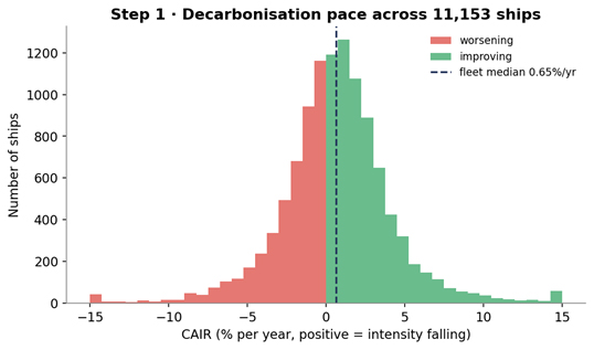
Coverage: 11,153 ships have a long enough history (≥ 4 years) to fit a trend; the fleet median pace is 0.65% per year.
Where this sits among the insights: Peer Benchmarking and Fleet Rankings are about level — how clean, where you stand. This insight is about pace — the sustained multi-year rate of change — and, like the others, it is made fair by comparing each ship only against its true peers.
The big picture — four steps
- Measure pace — fit each ship's intensity history to a single rate, CAIR (% per year).
- Peer median — take the median CAIR of each peer group — the typical pace for ships of that type, size, and age.
- Peer-relative verdict — compare each ship's CAIR to its peer median (faster/slower).
- Fleet picture — index each type's median intensity over time to see the whole fleet bending down.
In one sentence: fit each ship's intensity history to a CAIR → take the median CAIR of its peer group → flag who is decarbonising faster or slower than the ships genuinely like them → and confirm the fleet as a whole is bending down, only slowly.
Step 1 — Measuring decarbonisation pace (CAIR)
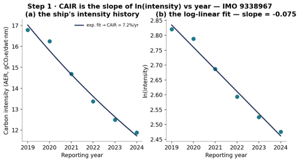
For every ship with at least 4 yearly data points we fit a straight line to the natural log of its intensity against year. The slope of that line is a compound annual rate; we report it as CAIR — the % per year by which intensity is falling (positive = getting cleaner). Intensity is the same fair metric used throughout: AER for cargo ships, the GT-normalised intensity for passenger/vehicle ships, on the effective CO₂eq basis.
slope = least-squares slope of ln(intensity) vs year
CAIR (%/yr) = −( e^slope − 1 ) × 100
positive = intensity falling. A log-linear fit over the ship's whole history (analytics/yoy_trend.py · _cair_pct, via numpy.polyfit).
Why a log-linear fit, not first-vs-last year? Fitting the log of intensity makes the slope a constant percentage rate (compounding), and using the ship's whole history means one noisy year cannot masquerade as a trend — a first-vs-last comparison would be hostage to the endpoints. The log also makes a 1%/yr improvement mean the same thing for a clean ship and a dirty one.
Across the fleet, 59.3% of ships are improving but most only slowly — the median ship shaves just 0.65% off its intensity per year, and 40.6% are actually getting worse. That modest, uneven pace is the backdrop: the interesting question is not whether a ship improved at all, but whether it improved faster than the ships like it.
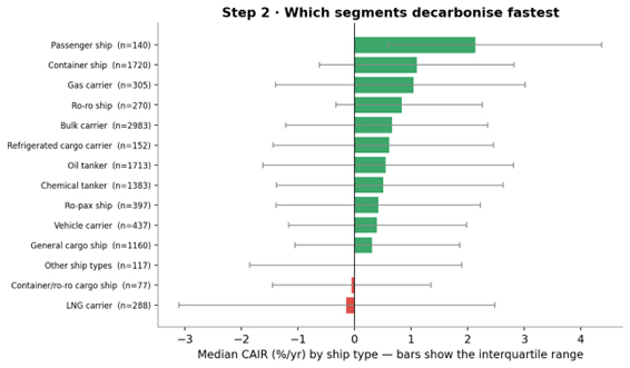
Step 2 — The peer-group median trend
Every segment decarbonises at its own pace — a modern container fleet renews and optimises faster than a fleet of small general-cargo ships. So each ship is tagged with a peer group and we take that group's median CAIR: the typical pace for ships of that type, size, and age.
Peer groups and the fallback ladder
- Scope — the same fair metric and ≥ 3,000nm activity scope as the other insights.
- Peer key — ship type × size band (within-type size tertile: small/mid/large) × age band (newer ≤10yr, mid 11–18, older >18, from the ship's most recent year).
The finest peer key is used only if it holds at least MIN_PEERS = 15
ships; otherwise the group falls back to type × size, then type alone — so every
median is computed over a stable number of genuine peers.
Step 3 — Faster or slower than your peers?
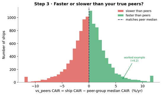
The peer-relative verdict is each ship's CAIR minus its peer-group median CAIR. A positive gap means the ship is decarbonising faster than the vessels genuinely like it — a segment-neutral signal of operational progress; a negative gap means it is falling behind peers that face the same constraints.
vs_peers CAIR = ship CAIR − peer-group median CAIRpositive = out-pacing your true peers; negative = lagging them.
Step 4 — The fleet decarbonisation picture
Stepping back from individual ships, we index each main type's median intensity to 100 in the base year (2018) and follow it forward — the aggregate trend that all those per-ship CAIRs add up to. It answers the macro question a regulator or financier asks: is the EU-scope fleet's carbon intensity actually bending down, and how fast?
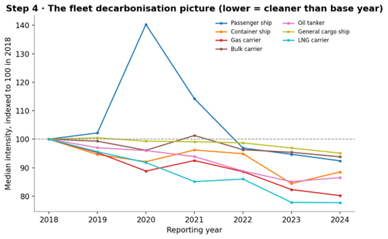
The gap between this realised pace and the steepening regulatory target is exactly what the CII Projection insight quantifies. The actionable layer remains Step 3: within every segment some ships are already moving several times faster than their peers — proof that the laggards' gap is operational, not inevitable.
Worked example — one ship vs its peer group
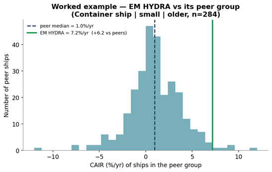
IMO 9338967 (EM HYDRA), a container ship with 6 years of history, is a clean illustration: its intensity falls almost perfectly log-linearly (the fit in Step 1 is this ship), giving a high, trustworthy CAIR.
| Quantity | Value | How |
|---|---|---|
| history length | 6 years | ≥ 4 required to fit a trend |
| CAIR | 7.2%/yr | −(e^slope − 1)×100 from the log-linear fit |
| peer group | small · older | Container ship × size tertile × age band |
| peer median CAIR | 1.0%/yr | median over 284 peers |
| vs_peers CAIR | +6.2%/yr | 7.2 − 1.0 |
Table. The full CAIR computation for EM HYDRA, reproduced from mrv.db.
Reading it: a ship cutting its carbon intensity about 7% every year — more than 6 points faster than the median ship of its own type, size, and age, whose peers manage only ~1%/yr. That gap is durable (it is a multi-year slope, not a single lucky year) and operational — the kind of progress a charterer or lender can reward.
Outputs, uses, and honest limits
What the insight emits. Per ship: cair, peer_median_cair, vs_peers_cair, n_years, the peer label, and size/age band. Fleet-wide: per-type CAIR (median + IQR), the indexed intensity curves, and the fleet median CAIR.
Why it makes sense and adds value. It is robust — the log-linear fit over the whole history is robust to a single odd year. It is fair — judging pace against the peer median is segment-neutral, so a slow-segment leader is recognised and a fast-segment coaster is exposed. It adds time — direction of travel is an early signal a level-only view (grade, rank) cannot give.
Honest limits. A ship needs ≥ 4 reported years to get a CAIR; younger ships and intermittent reporters are simply not trended. The intensity basis switches to CO₂eq in 2024, so a multi-year slope blends a CO₂ history with a CO₂eq endpoint — for GHG-heavy types (notably LNG, methane slip) this can depress the measured CAIR, so read LNG's flat-to-negative pace with that in mind. CAIR reflects trade pattern as well as engineering — a route or utilisation change moves intensity too — and the peer comparison controls for type/size/age, not every route effect. And 2020 carries a COVID distortion for passenger/utilisation-sensitive types; the whole-history fit absorbs it but it widens the spread.