

Plain question: for an operator's whole fleet — where does each ship rank, what grade does it hold, and what does the portfolio look like as one line in a table?
Output per operator: fleet size, dominant type, median rank + spread (p25–p75), the A–E grade mix, and the headline at-risk CO₂% (the share of fleet emissions carried by D/E ships).
Coverage: 3,161 operators are folded into one row each, every row drillable back down to its vessels.
How this differs from Operator Score: Operator Score reduces a fleet to a single 0–100 number and finds peer operators. Fleet Overview keeps the fleet legible as a portfolio — the grade mix, the rank spread, and the CO₂-weighted at-risk share, plus a vessel drill-down. Same shared per-ship engine, a different roll-up aimed at a charterer or lender scanning a fleet table.
The big picture — four steps
- Per-ship facts — grade (A–E) and rank (within type) for every 2024 ship, and attach its operator.
- Operator table — aggregate ships into one row per operator (size · median rank · grade mix · at-risk CO₂%).
- Grade bar — picture each big fleet as a CO₂-weighted A→E grade bar.
- Drill-down — expand any row back into its vessel list, worst-first.
In one sentence: per-ship fleet_rank (within type) + grade A–E (within peer group) → aggregated into one operator fleet table (size · median rank · grade mix · CO₂-weighted at-risk share) → drillable back down to the vessel list.
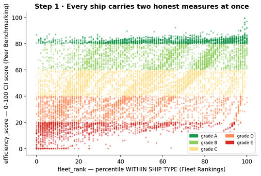
Step 1 — Two honest per-ship measures, side by side
From the shared 2024 engine each ship carries two distinct, complementary comparisons — both true, both useful:
- fleet_rank — the percentile position within its whole ship type (from Fleet Rankings); 100 = cleanest of its type.
- grade A–E — the simplified CII rating within its tight size·age peer group (from Peer Benchmarking); A and E exist in every segment.
Plus the ship's operator (company_imo). The two measures are
related but not identical: a ship can rank mid-pack across its whole type yet
earn an A for being the cleanest of its own size·age cohort, or vice versa.
Step 2 — The operator fleet table
This is the headline deliverable: one row per operator, carrying what a charterer, lender, or regulator wants on a single line.
| Column | What it is |
|---|---|
| fleet_n · dominant_type | how many ships, and what kind of fleet it is |
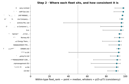
| median_rank · p25–p75 | where the fleet sits within its type, and how consistent |
| grade_mix (A–E counts) | the spread of A–E vessels, e.g. "A2 B5 C9 D3 E1" |
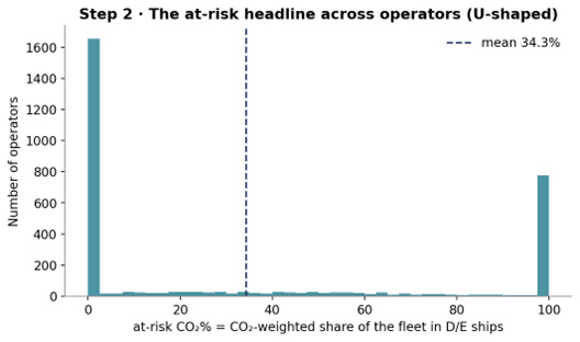
| at_risk_co2_pct | the CO₂-weighted share of fleet emissions carried by D/E ships |
Table. The per-operator columns (analytics/fleet_overview.py · compute).
The at-risk headline — and why it's CO₂-weighted:
at-risk CO₂% = Σ CO₂ of the fleet's D/E ships / Σ CO₂ of the whole fleet × 100the fraction of a company's emissions (not its ship count) sitting in poorly-graded ships.
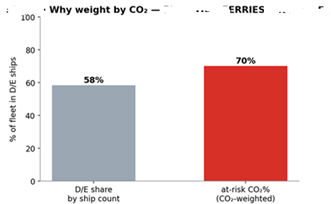
Why weight by CO₂ and not count? A company's climate exposure is dominated by its biggest, busiest emitters, so the at-risk figure should ask "what share of the carbon comes from dirty ships?", not "what share of the hulls?". One efficient harbour launch can't paper over a fleet of thirsty workhorses — and, conversely, a few large dirty ships make a fleet at-risk even if most of its vessels are clean.
Step 3 — Each big fleet as a CO₂-weighted grade bar
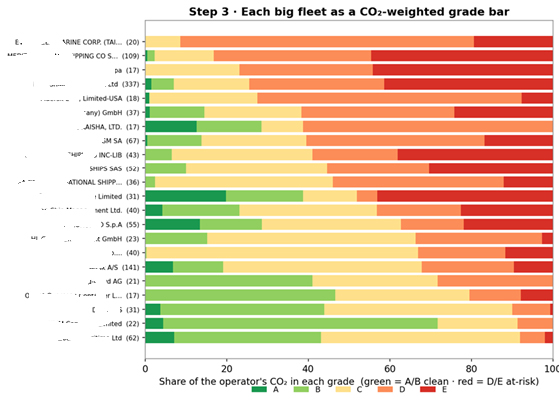
The table is precise; a picture is faster. For the biggest operators by CO₂ we draw each fleet as one horizontal bar split A→E by share of the operator's CO₂ (green = clean grades, red = D/E) — the same at-risk CO₂% from the table, now visible at a glance.
Step 4 — Expand one row → the vessels behind it
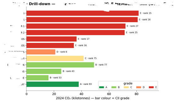
A fleet table is only trustworthy if you can open a row and see the ships. Each operator row decomposes back into its vessels — type, size, age, fleet_rank, and grade — sorted worst-first, the exact drill-down an API or dashboard serves when a user clicks an operator.
Worked example — one fleet, summarised and opened up
A 12-ship ro-pax operator, as one table line: median rank 26 (p25–p75 16–58), grade mix A1 B3 C1 D1 E6, at-risk 70% of CO₂.
| Vessel | Type | Size | Age | Rank | Grade | CO₂ kt |
|---|---|---|---|---|---|---|
| 1 | Ro-pax | 18,663 | 13 | 15 | E | 82 |
| 2 | Ro-pax | 18,664 | 12 | 16 | E | 81 |
| 3 | Ro-pax | 29,858 | 24 | 27 | E | 72 |
| 4 | Ro-pax | 29,858 | 24 | 25 | E | 71 |
| 5 | Ro-pax | 10,438 | 22 | 17 | E | 36 |
| 6 | Ro-pax | 10,438 | 22 | 16 | E | 34 |
| 7 | Ro-ro | 13,073 | 24 | 6 | D | 21 |
| 8 | Ro-pax | 32,071 | 33 | 75 | C | 42 |
| 9 | Ro-pax | 27,230 | 37 | 77 | B | 49 |
| 10 | Ro-pax | 15,362 | 34 | 43 | B | 25 |
| 11 | Ro-ro | 23,986 | 27 | 53 | B | 16 |
| 12 | Ro-pax | 29,992 | 32 | 93 | A | 38 |
Table. The fleet's vessel drill-down, reproduced from mrv.db (worst-first). The grade is the absolute CII rating; the rank is relative position within the Ro-pax type.
Reading it: 7 of 12 ships are D/E by count (58%), but because the large, hard-working ferries are the E-graded ones, they carry 70% of the fleet's carbon. The single table line flags the fleet as high-risk; the drill-down names exactly which six ferries a decarbonisation plan must target.
Outputs, uses, and honest limits
What the insight emits. Per operator: fleet_n, total_co2_kt, dominant_type, median_rank / p25_rank / p75_rank, the n_A…n_E counts, grade_mix, and at_risk_co2_pct. The vessel drill-down reuses the per-ship grade/rank already in the cache.
Why it makes sense and adds value. It is a portfolio view — the grade mix and rank spread keep a fleet legible as a portfolio, not a single number. It is actionable — at-risk CO₂% points straight at the emissions that decarbonisation effort should target. It is auditable — any summary row opens into named ships on the same fair, peer-relative footing.
Honest limits. Operator identity is only published from 2024, so this is a single-year snapshot; a year axis (fleet grade-mix trajectory) arrives once 2025+ files land. Grade and rank are two different lenses (absolute CII vs within-type percentile) — a vessel can look good on one and average on the other, and both are reported on purpose. The table inherits every Peer Benchmarking caveat (CO₂eq basis from 2024, the 3,000nm activity floor, un-rated types excluded from the grade mix). And the code aggregates any operator with ≥1 rated ship, so robust portfolio reading still needs a few ships — which is why the charts focus on larger fleets.